Inline Buttons (AI Assistant)
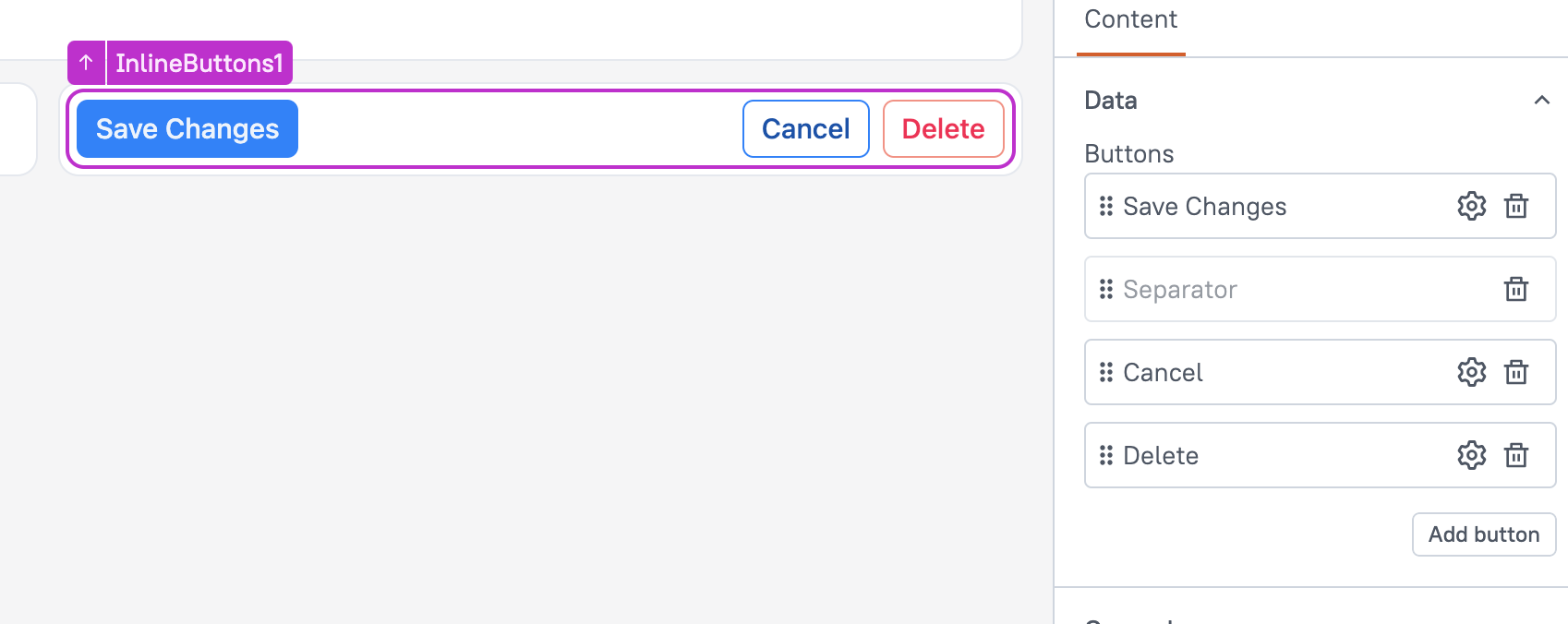
This page provides information on the Inline Buttons widget(available in AI Assistant Apps), which enables placing multiple buttons in a single row with a customizable separator.

Content properties
These properties are customizable options present in the property pane of the widget, allowing users to modify the widget according to their preferences.
Data
Defines the options and datasources for the widget, determining the content displayed to users.
Buttons
This property allows you to add customizable buttons within the widget. You can add, delete, or rearrange buttons to fit your specific layout needs.
By default, a Separator is included, which divides button groups. You can remove or reposition the Separator, but only one Separator is allowed in the widget.
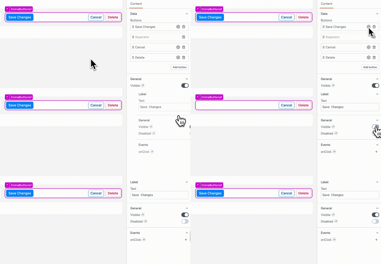
Each button can be individually configured by clicking the gear icon next to it. For more details, see Button Settings.
Visible boolean
This property controls the visibility of the widget. If you turn off this property, the widget would not be visible in view mode. Additionally, you can use JavaScript by clicking on JS next to the Visible property to conditionally control the widget's visibility.
For example, if you want to make the widget visible only when the user selects "Yes" from a Select widget, you can use the following JavaScript expression:
{{Select1.selectedOptionValue === "Yes"}}
Animate Loading boolean
This property controls whether the widget is displayed with a loading animation. When enabled, the widget shows a skeletal animation during the loading process. Additionally, you can control it through JavaScript by clicking on the JS next to the property.
Buttons Settings
This property allows you to configure individual buttons within the group. By clicking the gear icon next to a button, you can update its label and events for that button.

Text label
Specifies the label displayed on the button.
Visible boolean
Controls the visibility of the button. When set to true, the button is displayed; when false, it is hidden.
Example: If you want to display Button only when Checkbox is checked, use:
{{Checkbox1.isChecked ? true : false}}
Disabled boolean
This property disables the specific button, preventing users from interacting with it. The button remains visible but cannot be clicked. You can use JavaScript by clicking the JS icon next to the Disabled property to conditionally control the button's disabled state.
Example:
{{appsmith.user.email=="john@appsmith.com"?false:true}}
onClick
Allows you to configure one or multiple actions (Framework functions, queries, or JS functions) to be executed when the button is clicked. You can chain multiple actions together, and all the nested actions would run simultaneously.