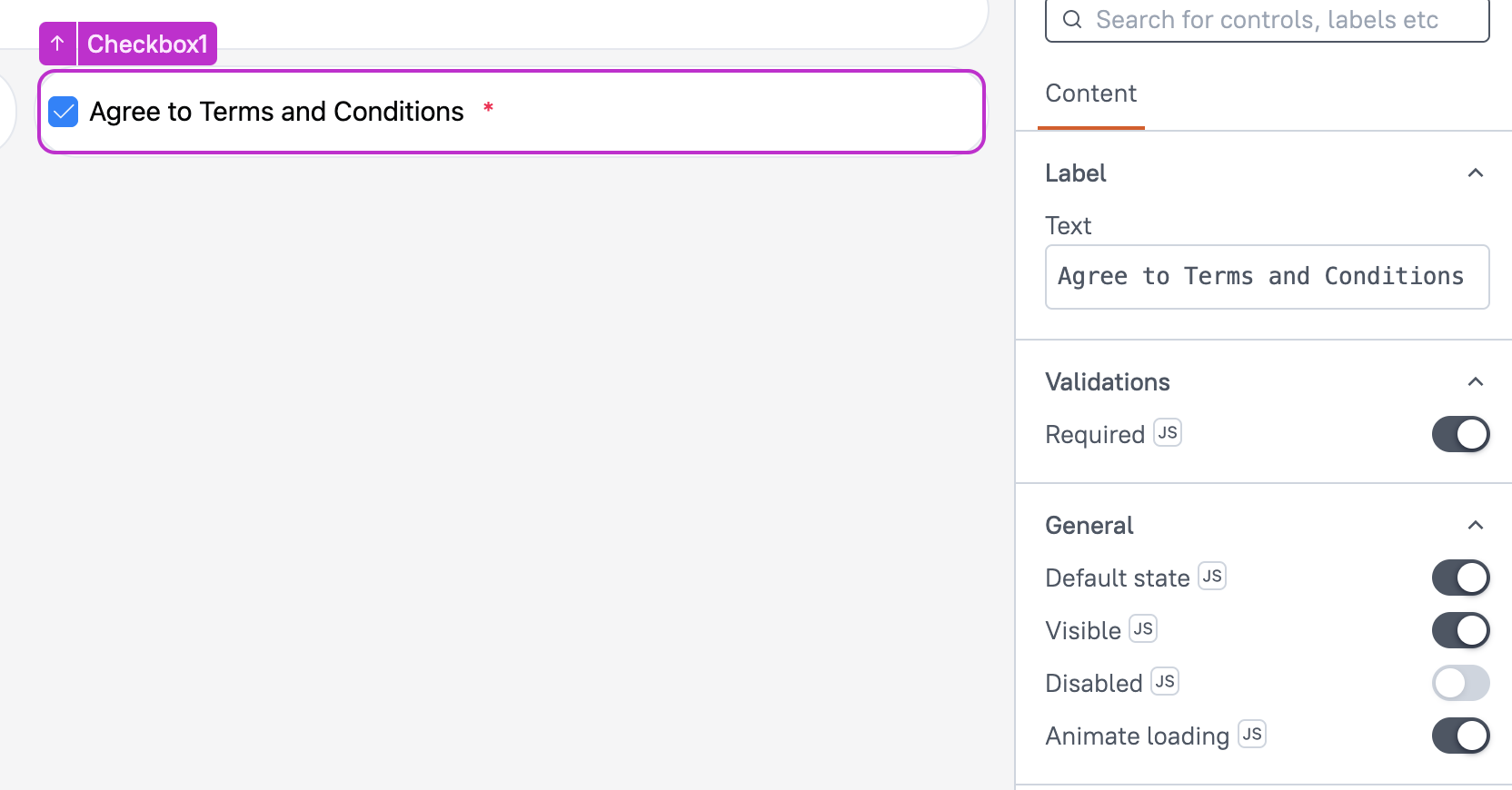
Checkbox (AI Assistant)
This page provides information on using the Checkbox Widget, which allows you to collect boolean input from users. It enables you to create interactive checkboxes that users can check or uncheck. This widget is ideal for scenarios such as selecting options, agreeing to terms, or enabling/disabling settings in your app.
This widget is only available in AI Assistant Apps and cannot be used in Classic Apps.

Content properties
These properties are customizable options present in the property pane of the widget, allowing users to modify the widget according to their preferences.
Label
Text String
Sets the label for the Checkbox widget. This is the text displayed next to the checkbox, helping users understand the purpose of the checkbox. The label can also be dynamically updated using mustache bindings {{}}, allowing you to change the label based on user input or other conditions in your app.
Validations
Required boolean
Enables the checkbox as a mandatory field. When enabled, the form cannot be submitted until the checkbox is checked. This is useful for ensuring user consent or acknowledgment within a form.
General
Default State boolean
Sets the initial state of the checkbox, determining whether it is checked or unchecked by default when the page loads. When enabled, it sets the checkbox to be checked by default.
Visible boolean
This property controls the visibility of the widget. If you turn off this property, the widget would not be visible in view mode. Additionally, you can use JavaScript by clicking on JS next to the Visible property to conditionally control the widget's visibility.
For example, if you want to make the widget visible only when the user selects "Yes" from a Select widget, you can use the following JavaScript expression:
{{Select1.selectedOptionValue === "Yes"}}
Disabled boolean
This property prevents users from selecting the Checkbox widget. Even though the widget remains visible, user input is not permitted. Additionally, you can use JavaScript by clicking on JS next to the Disabled property to control the widget's disable state conditionally.
For example, if you want to allow only a specific user to interact with the Audio Recorder widget, you can use the following JavaScript expression in the disabled property:
{{appsmith.user.email=="john@appsmith.com"?false:true}}
Animate Loading boolean
This property controls whether the widget is displayed with a loading animation. When enabled, the widget shows a skeletal animation during the loading process. Additionally, you can control it through JavaScript by clicking on the JS next to the property.
Events
onCheckChange
This event defines the action that would be executed when the user checks or unchecks a checkbox. It allows you to specify a list of supported actions that can be triggered in response to the checkbox state change.
Reference properties
These properties are not available in the property pane, but can be accessed using the dot operator in other widgets or JavaScript functions. For instance, to get the visibility status, you can use Checkbox1.isVisible.
isChecked boolean
The isChecked property indicates whether the checkbox is currently checked or not. It is represented by a boolean value, where true signifies that the checkbox is checked, and false signifies that it is unchecked.
isDisabled boolean
The isDisabled property reflects the state of the widget's Disabled setting. It is represented by a boolean value, where true indicates that the widget is disabled, and false indicates that it is enabled for user interaction.
isVisible boolean
The isVisible property reflects the state of the widget's Visible setting. It is represented by a boolean value, where true indicates that the widget is visible, and false indicates that it is hidden or not displayed on the page.
Methods
Widget property setters enable you to modify the values of widget properties at runtime, eliminating the need to manually update properties in the editor.
These methods are asynchronous and return a Promise. You can use the .then() block to ensure execution and sequencing of subsequent lines of code in Appsmith.
setVisibility (param: boolean): Promise
This allows you to change the visibility of widget based on conditions or user interactions within JS.
Example:
Checkbox1.setVisibility(true)
setDisabled (param: boolean): Promise
Sets the disabled state of the widget.
Example:
Checkbox1.setDisabled(false)
setValue (param: boolean): Promise
Allows you to dynamically set the value of the Checkbox widget.
Example:
Checkbox1.setValue(true)
setRequired (param: boolean): Promise
Sets whether the widget is required or not.
Example:
Checkbox1.setRequired(true)